Better Post List Styles
Post lists on BearBlog are not well styled by default. But you can add custom styles to both post lists WITH descriptions AND withOUT descriptions.
To use my styles, copy the Code below and paste into your Theme's CSS.
The styles below will only address the structure of your post lists. My colors are not included in the code below.
Warning: This code does not address when a post's CONTENT or IMAGE is displayed within the list, and may produce unexpected results in those cases.
Also See: BearBlog Tools/Tips
While You're Here: Please ask Steam to improve RSS Support
My Lists
(Note the Example links will be different depending on if you're on Mobile or Desktop)
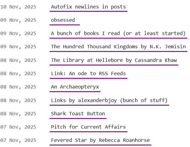
WithOUT descriptions
minor layout tweaking, looks basically the same on mobile. See an example here
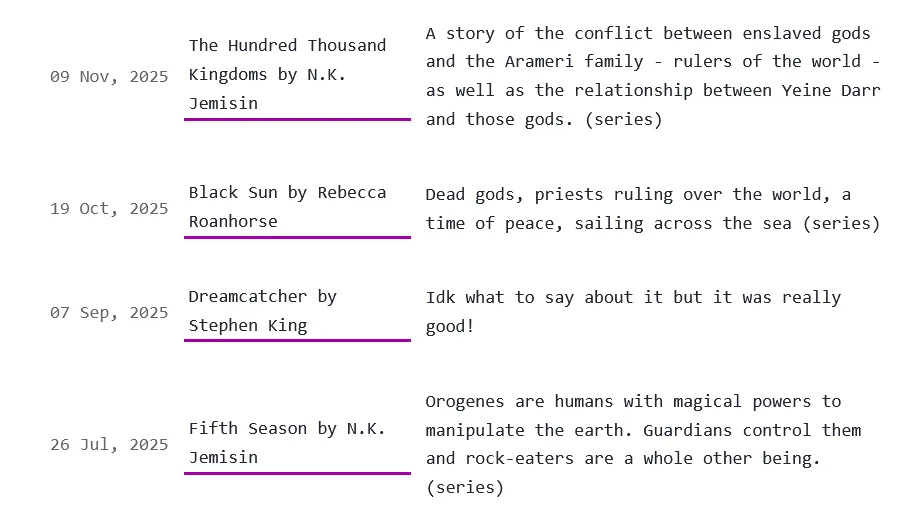
With Descriptions on Desktop and wide screens
It's a perfect grid. Example
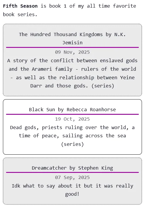
With Descriptions on Mobile
Each list item is a little card. Example
Code
/* blog post list structure, for when there is NO description */
ul.blog-posts:not(:has(> li > p)) {
    list-style-type: none;
    padding: unset;
}

ul.blog-posts:not(:has(> li > p)) li {
    display: flex;
    margin-bottom: 10px;
}
ul.blog-posts:not(:has(> li > p)) li > a {
     min-width: 5em;
}

ul.blog-posts:not(:has(> li > p)) li span {
    flex: 0 0 130px;
}


/* Make lists into grids on screens wider than 600px, only for lists containing descriptions */
@media (min-width: 600px) {
  ul.blog-posts:has(> li > p) {
      display: grid;
      grid-template-columns: auto 1fr 2fr;
      grid-template-rows: auto;
      grid-gap: 8px;
  }

  ul.blog-posts:has(> li > p) > li {
      display:grid;
      grid-template-columns: subgrid;
      grid-column: 1 / span 3;
      align-items: center;
  }

  ul.blog-posts:has(> li > p) > li > span {
      grid-column: 1;
  }
  ul.blog-posts:has(> li > p) > li > a {
      grid-column: 2;
      margin: 0 4px;
  }
  ul.blog-posts:has(> li > p) > li > p {
      grid-column: 3;
  }
}

/* Make list items into cards, only for lists containing descriptions, when screen width is LESS than 600px (for mobile) */
@media (max-width: 600px) {
  ul.blog-posts:has(> li > p) {
    list-style-type: none;
    margin: 0;
    padding: 0;
  }

 ul.blog-posts:has(> li > p) > li {
      display:flex;
      flex-direction: column;
      padding: 16px 8px;
      margin: 8px 0;
  }
  /* every other list item will have a grey background */
  ul.blog-posts:has(> li > p) > li:nth-child(2n - 1) {
      background: #eaeaea;
      border-radius: 8px;
      border: 1px dotted black;
  }
   ul.blog-posts:has(> li > p) > li:nth-child(2n) {
      border: 1px solid black;
      border-radius: 8px;
  }

  ul.blog-posts:has(> li > p) > li > span {
      order: 2;
      text-align: center;
  }
  ul.blog-posts:has(> li > p) > li > a {
      order: 1;
      text-align: center;
  }
  ul.blog-posts:has(> li > p) > li > p {
      order: 3;
      text-align: center;
      padding: 0;
      margin: 0;
  }
}
How To Do It Yourself
To target posts withOUT descriptions, you use this selector:
ul.blog-posts:not(:has(> li > p)) ...
To Target posts WITH descriptions, you use this selector:
ul.blog-posts:has(> li > p) ...